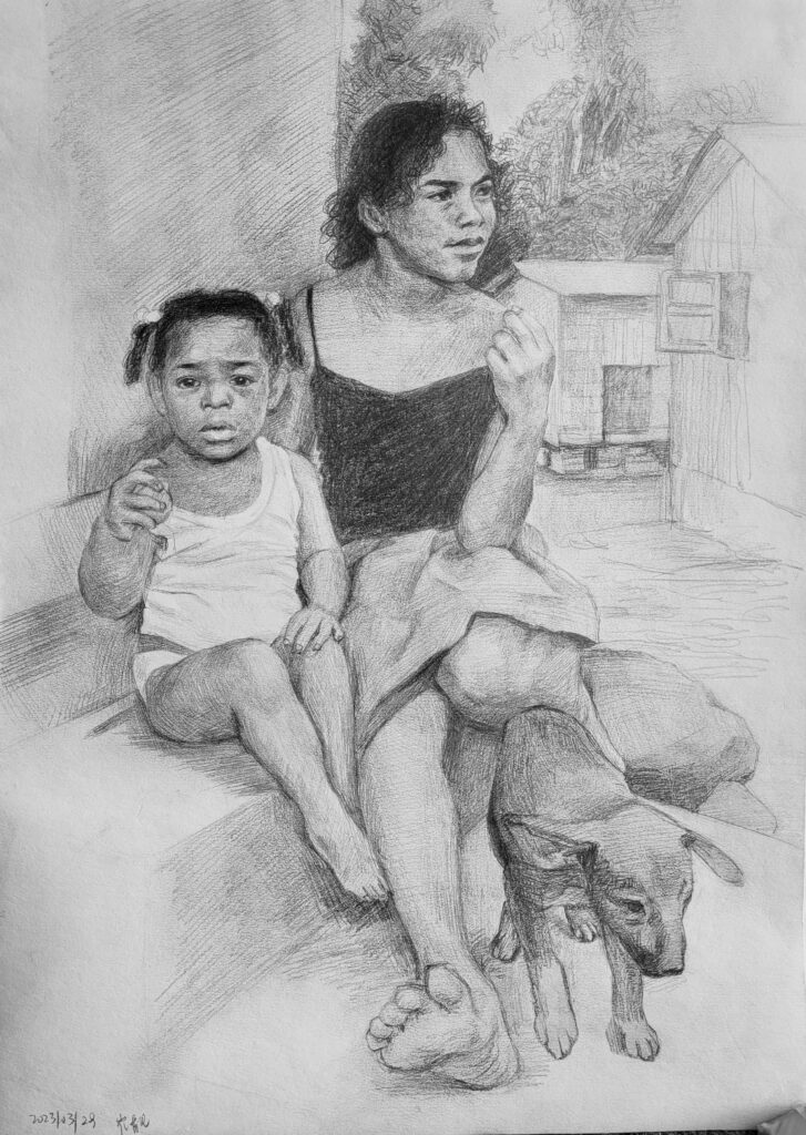
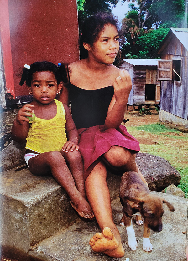
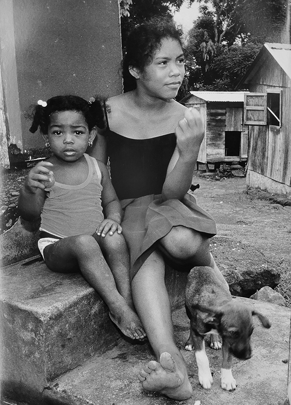
这张练习主要的目的在于将一张彩色的照片在素描的过程中转化为黑白灰的关系。原图是左边那张彩色照片,而右边的是在Photoshop中去色后的图片。
The main purpose of this practice is to shift a colour photo into a monochrome sketch. The original photo was desaturated into a white and black photo in Photoshop to compare with the finished drawing.
在我根据这些带有颜色的色块把画面转化为单色素描时,可以看出颜色本身的饱和度也在影响着我的判断。比如说,左边的小女孩身上亮黄色的小背心在去掉颜色之后和小女孩的肤色明度相近。而我的素描中,这件小背心的明度非常亮。这是因为这个黄色看起来非常显眼,所以我感觉在将这个画面转化成黑白灰的关系时,需要一个明度很高的色块(尤其是与右边少女的黑色背心对比)来表现这种显眼的程度。再仔细看下去,发现右边少女穿的酒红色的裙子明度和左边小女孩脖子周围肤色的明度差不多。但我的画里面这件红裙子的明度明显要亮一些。
When I converted the picture into a monochrome sketch, I could see that the saturation of the colours also affected my judgement. For example, the bright yellow vest on the little girl on the left is similar to the brightness of the little girl’s skin after desaturation. Yet, in my sketch, the little vest is much brighter than the little girl’s skin. This is because the yellow colour stands out and in a monochrome sketch, the only way to convey this visual effect is to have the vest forming a strong contrast with the areas nearby, especially compared with the black vest of the girl on the right. Looking more carefully, you will find that the dark red skirt on the girl on the right is about the same brightness as the skin around the neck of the girl on the left. But the brightness of this red dress in my sketch is brighter.
对我个人来说,这些反应出来我们的大脑并不会非常机械和完美地在这些色块中只提取出一个单一的因素(比如明度),同时将其他因素(比如彩度)带来的影响给屏蔽掉。我们大脑在综合地将不同的信息带来的刺激和感受结合在一起来接受和处理。这个例子中观察到的这个现象,对于我们画色彩有一定帮助。从我个人的经历来看,在画一些鲜亮的颜色的时候,需要辨识出颜色的亮度和饱和度是一个色块的两个属性。虽说一块饱和度很高的颜色和一块亮度很高的颜色都会带给我们强烈的视觉体验,但是不代表饱和度高的颜色就等于明度很亮。在我之前的色彩练习中,同样有过多次被高饱和度的色块给迷惑的经历。因为画上去的颜色在明度上不够暗,导致最后某些结构上面的关系也不太对。每当把色块的明度降低,结构上的明暗关系一下就感觉对了。
In my opinion, these reflect that in the process, the brain does not mechanically extract a single factor (such as brightness) from these colours and block out the influence from other factors (such as saturation). The brain receives, and processes, the stimuli and feelings it has got all together. This realisation can be helpful in drawings with colours. Although the visual experiences brought by a pitch of colour with high saturation can be quite similar with it from a pitch of colour with high brightness, saturation and brightness, after all, are two different attributes for a pitch of colour in the drawing process. It has happened more than once in my drawing process that I tend to draw a pitch of colour with high saturation with a high brightness as well. Because of this, the resulted drawing looked not quite right. When I darken the pitch of colour, it would look better.
不过,从画面最终的结果来看,小女孩明度很高的背心和右边少女的黑色吊带形成了强烈对比,从而有助于将观众的视线在一开始就吸引到这两个画面的主体身上。处于同样的原因,对于少女背后的房屋,我减弱了窗户处和门里阴影和外面墙壁等浅色的对比。如果看原图照片的黑白照,就会发现因为两个女孩子身上的对比比较弱,背后的房屋门窗阴影等的对比过于强烈,就会阻止观众在一开始将视线集中于这两个女孩子的身上。这也提醒我们需要对画面进行一种主动的处理和取舍,来突出重点以及减少那些不重要的部分的干扰。
However, as a resulted drawing, the high brightness of the little girl’s vest who is on the left forms a strong contrast with the girl’s vest who is on the right. This is helpful to draw audience attention to them as the two important subjects of this drawing. For the same reason, I also weakened the contrast between the dark pitches inside the window and the door with their surroundings behind the two girls. After desaturating the original colour photo into white and black, we find that it is hard for it to draw audience attention to the two girls in the first sight. One reason is that the contrasts between different pitches on them are quite weak, and the area behind them has some areas with strong contrast.


