这个练习主要涉及了对于画面的构成的思考以及应用。这张画的参照物是一张照片。照片的好处在于能够在足不出户的条件下提供不同的场景、人物形象和人物某一瞬间的动态。这些好处尤其有利于构图练习。面对一张照片,我们不需要担心场景发生变动,从而有充裕的时间来分析画面,思考自己如何通过画面构成来达成某些艺术的表达。
One main aim of this drawing is the practice of the composition of a picture. I referred to a photo from a book. A good thing about using a photo to refer to for a drawing is that you do not need to go out to travel around the world and can get access to different scenes that exist in different times and areas. Also, the photo is excellent to catch a fleeting moment and ‘freeze’ it, so there will be enough time for artists to analyse and draw. For composition practice, artists do not need to worry the scene will change if refer to an existing photo and have time to analyse and think about how to arrange different parts of the image.

画面构架分析
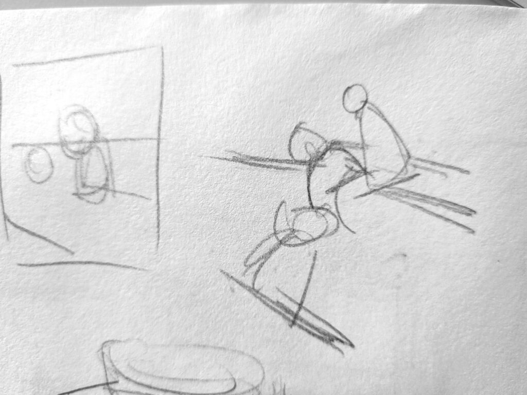


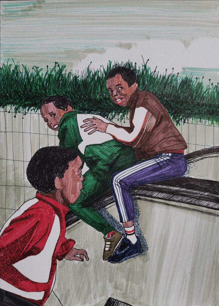
原图吸引我的是这三个男孩子的动态形成的一种动势和周围环境中的直线(比如说扶梯把手以及花坛)之间的关系。三个男孩子的头部以及他们身体的动势形成了一个向下的斜线。这条向下的斜线和花坛的边缘线形成了一个三角形。一般来说,我们的视线都会被三角形的顶端、也就是尖角处给吸引。这个图画中处于三角尖角处的是上方那两个男孩子的脸部。我打算集中于这种动势与周围这些线条之间的关系,而忽略掉画面中其他的元素。1
What was interesting to me in the original photo are these lines in it, such as the edge of the flower bed, the line that forms by the three boys’ heads, and the escalator’s handles, etc. The downward-sloping line by the three boy’s heads forms a triangle with the edge line of the flower bed. Generally speaking, our eyes will be attracted by the sharp corners of a triangle, which would be the two boys’ faces in this photo. My intention is to focus on the relationships between these lines and ignore other areas in the photo.
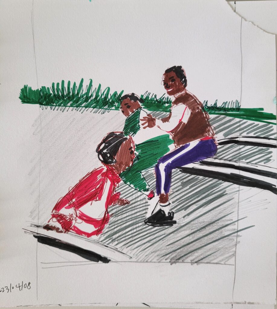


因为最终我是想画一张彩色的画,在分析了画面中大的线性因素和它们之间的关系后,我做了一个小的色稿来感受色彩对于画面的影响。我比较喜欢原图中的几个主要的颜色 – 暗红、熟褐、墨绿、黑色、酞青蓝、浅褐、浅灰。这些颜色都不是很鲜嫩的颜色,使得这个场景显出了某一种硬派漫画风格中的生活感。几乎每个色块都有清晰的边缘线,使得几个白色色块得到了突出,增加了一种形式感和装饰性。同时,在画面中不同地方有一些小的红色色块,比如最右边男孩的袜子上和袖子上的红条、背后一条窄窄的红色,以及中间男孩子脚踝处露出来的红色袜子。这些小小的红色都和左边男孩深红色的衣服形成了一种呼应。红色是一种很有装饰性的、醒目的颜色,这种呼应让整个画面看起来比较活跃。
Since I want to draw it in colour, I made a small colour draft after the last step to understand the influence of the colours. I like the main colours in this photo – crimson, burnt umber, blackish green, phthalo blue, black, light brown, and light grey. These colours are neither very bright nor tender, which reminds me of a hardcore comic style, while at the same time quite realistic. Nearly each colour pitch is with its defined edge, therefore a couple of white areas stand out. This enhances the whole image’s decorative aspect. At the same time, there are several small crimson pitches which echo with the crimson on the boy’s coat, who faces to the right. Crimson is an eye-catching colour, and this echoing definitely enhances a sense of the rhythm of the image.
在完成色稿后,我用色卡纸剪了四个纸条用于遮蔽这张色稿上不同的部分,从而感受不同取景带来的效果。我们在这个过程中最好选择中性色的颜色温和的卡纸,比如灰色。当然,我们也可以借用手机拍一张照片,然后用照片编辑里面的截图功能来以不同的方式裁剪画面,比较得到的不同结果呈现出来的效果,然后选出自己比较满意的构图。
Afterwards, I cut four strips from a piece of cardboard to cover different areas of the draft to understand the effect of different compositions. It would be better to choose cardboard with a neutral and mild colour rather than those with bright colours. Another way of doing it is to use our cellphones (or camera) to take a photo of the draft, and then to use the editing photo function (or editing image software on our computer) to cut the photo in different ways.

当我认为得到了自己想要的取景后,按照得到的结果的长宽比和原图的尺寸做了一个取景框,然后将这个取景框用橡皮泥固定在原图上遮住其他部分。这样在画的过程中就不会受到其他部分的干扰,也更方便去观察画面中各部分之间的比例关系等。
When I got the frame I wanted, I used the same cardboard (cut the central area off according to the ratio) to cover the areas of the photo which I don’t need to draw. This step is to avoid us being distracted by these elements in the covered areas during our drawing. We can use some blu-tack to fix the cardboard frame on the original photo.
在绘画过程中,我对花坛后面的背景做了一些改动。首先我去掉了那些建筑物,因为它们过于复杂,会冲淡对于前面主要部分的关注。其次,我在花坛后面增加了一片云层。在这张画中的几个大的直线元素很显眼,多了后会有种单调的僵硬感。而这片云层虽然大体的走向依然是一条直线,但是它的曲线成分会冲淡这种僵硬感。
In the process, I changed the background behind the flower bed. At first, I omit those buildings since they could be too distracting. Then I added a piece of cloud. In this drawing, it is quite obvious that the major structural element is these straight lines, which makes the whole drawing a bit rigid. A cloud can be a suitable solution in terms of this. It is mainly another line, yet with the curves, it is able to reduce this sense of rigidity brought by the straight lines in the drawing.
我用Photoshop稍微改变了一下画的配色等,得到了一些有趣的结果。
The images below are what I got from editing the photo of the drawing in Photoshop. It was very fun.


1. 在分析画面的阶段,下笔时一定要简化画面中的元素,比如说只集中于几个重要的线条、以及大概的黑白灰关系。这有助于让画面中的大关系一目了然,减少细节的干扰。
- In the step of analysing, we have to simplify the elements and focus on the several most important ones, such as a couple of lines which are the most obvious in an image, and/or the tones. It is to have the most important elements in an image more obvious to us, and to reduce the distraction from some minor details.


